Type Design & Lettering
The Font Designers Created to Poison AI
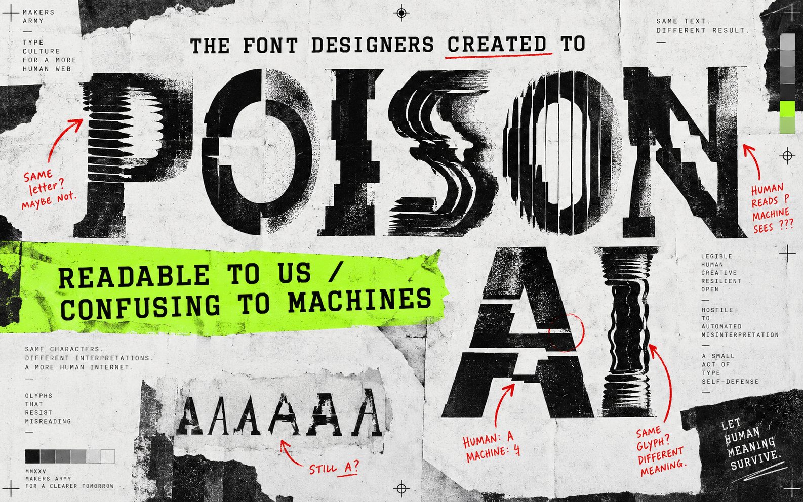
Some type designers are not trying to make the prettiest font in the world. They are trying to make machine-learning systems choke on it.
Some type designers are not trying to make the prettiest font in the world. They are trying to make machine-learning systems choke on it.
The idea is simple enough to understand: alter letterforms so they still look readable to a person but create confusing training data for image models. Creative Bloq has reported on free fonts designed to “poison” AI, and the story is interesting because it turns typography into a tiny act of resistance.
A letter has two audiences now
Humans read shapes by context. We can cope with a strange “a” or an uneven curve because the word gives us clues.
Image models do not read quite like that. They learn from patterns, repeated forms and examples. A small change that is harmless to a person may be noisy to a system collecting visual data.
The practical lesson is not “make ugly type”
It is that type has behaviour. A font is not just a mood. It affects reading speed, cutting, engraving, legibility, licensing and now the way images are interpreted by machines.
For a maker, this is a reason to test lettering physically. Print it small. Cut it. Engrave it. Turn it into a stencil. If a letter only looks good at poster size, it is not ready for a product.
Try this: choose one word and test three versions at the actual size you plan to make it. The best font is the one that survives the material.
Useful resource
Open the source: Creative Bloq archive ↗
Start with the primary source, then follow the practical takeaway in this story.
Open resource