
Web & UX
The Free App That Works Like Tinder for Video Games
Most game stores are very good at showing you thousands of things and very bad at helping you choose one.
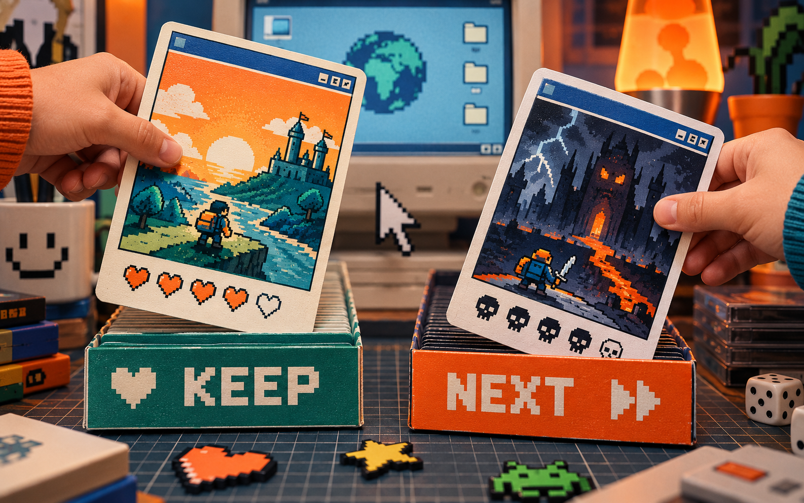
Most game stores are very good at showing you thousands of things and very bad at helping you choose one.
That is why a simple swipe-based discovery tool is such a good product idea. Instead of searching by genre, price and platform until your brain gives up, you react to one game at a time and keep the ones that look interesting. Creative Bloq's 2026 archive picked up the idea because it feels obvious once you see it.
The interface has one job
It is not trying to explain the entire catalogue. It is trying to make the next decision easy.
That is a useful rule for any small website, product card or download library. If the reader has to compare twelve things before they can make one choice, the interface is handing the work back to them.
One choice at a time beats a wall of options
For a maker shop, this could mean showing one bundle, one material or one personalised option at a time. Ask “would you make this?” before asking the customer to understand the whole catalogue.
The important bit is not copying the swipe gesture. It is reducing the size of the decision.
Try this: take your most crowded product page and rewrite it so the first screen answers only one question.
Useful resource
Open the source: Creative Bloq archive ↗
Start with the primary source, then follow the practical takeaway in this story.
Open resource