
Game & Interactive Design
Why This Game Looks Like a Graphic Novel You Can Walk Through
The easiest way to make a game look expensive is usually to add more detail.
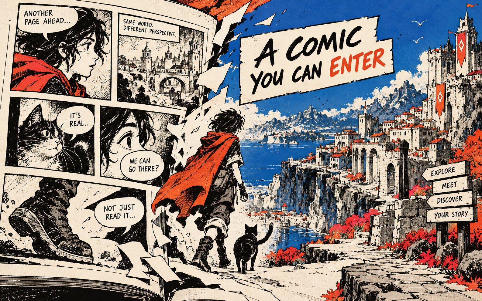
The easiest way to make a game look expensive is usually to add more detail.
The more interesting way is to choose a visual rule and stick to it. A hand-drawn world can feel more complete than a realistic one because every line belongs to the same idea.
That is why illustrated indie games keep getting shared. Their screenshots are readable in half a second. You can see the mood, the joke and the world before somebody explains the rendering pipeline.
Style is a shortcut to recognition
If your characters, backgrounds, menu screens and icons all use the same marks, the player learns the world faster. The style becomes navigation.
This applies to a product range as well. A maker who repeats one line quality, border shape or colour logic can make five separate items feel like one collection.
Do not start by drawing everything
Make one small style sheet. One character, one object, one background texture, three colours and one example of how text sits on top. If that little group feels like it belongs together, expand it.
Try this: make a five-piece visual rulebook before making the full collection.
Useful resource
Open the source: Creative Bloq game coverage ↗
Start with the primary source, then follow the practical takeaway in this story.
Open resource