Service & UX Research
The Logo Designed So a Blind CEO Could Actually Use It
Here is a branding question most agencies do not ask early enough: what if the person leading the organisation cannot see the logo?
Here is a branding question most agencies do not ask early enough: what if the person leading the organisation cannot see the logo?
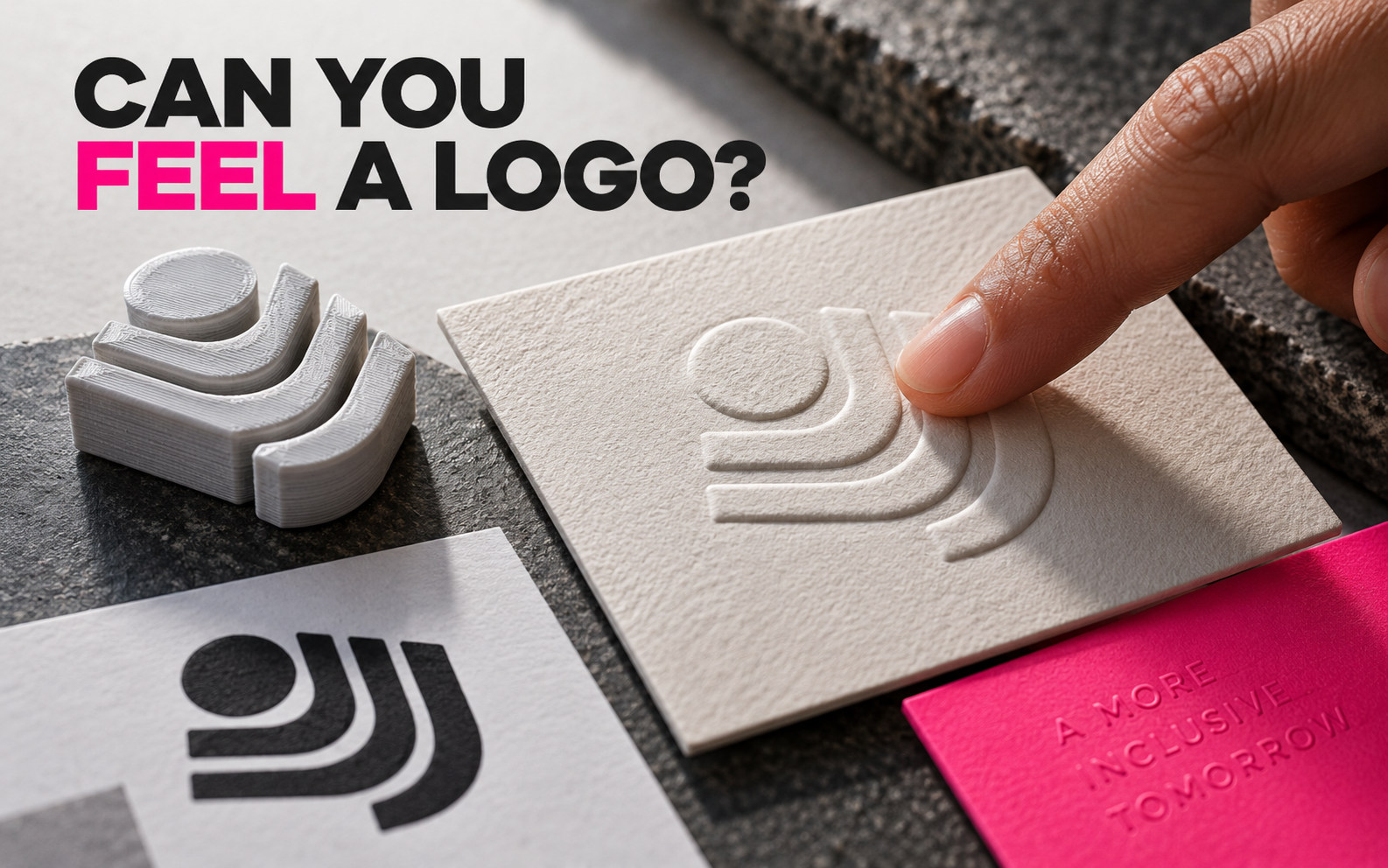
That was the real challenge behind the Onvero rebrand. The organisation's CEO is blind, so the design process had to work beyond the usual parade of colour palettes, moodboards and screens. Creative Bloq's case study explains how the studio changed its communication and made the mark easy to draw by hand.
Accessibility changed the design, not the ambition
The result was not a boring identity with all the personality removed. The logo was also 3D-printed as a tactile gift, and the team rethought how concepts were presented and described.
That is the bit worth stealing. Accessibility was not added at the end as a checklist. It changed the questions at the beginning.
Can somebody describe the mark without pointing at it? Can it be recognised by shape rather than colour? Can it survive being photocopied, embossed, cut from wood or drawn by a child?
A quick test for your own branding
Print your logo in black and white. Turn it upside down. Trace it with your finger. Ask someone else to describe it without using the brand name.
If the identity only works when it is in the correct colour on a perfectly calibrated screen, it is not a very flexible identity.
Try this: make one physical version of your logo—engraved, embossed, cut or raised—and see what remains when colour disappears.
Useful resource
Open the source: Creative Bloq ↗
Start with the primary source, then follow the practical takeaway in this story.
Open resource