Illustration
Why Designers Are Suddenly Sick of Perfect Everything
I like a clean file. I also like it when I can tell a person made it.
I like a clean file. I also like it when I can tell a person made it.
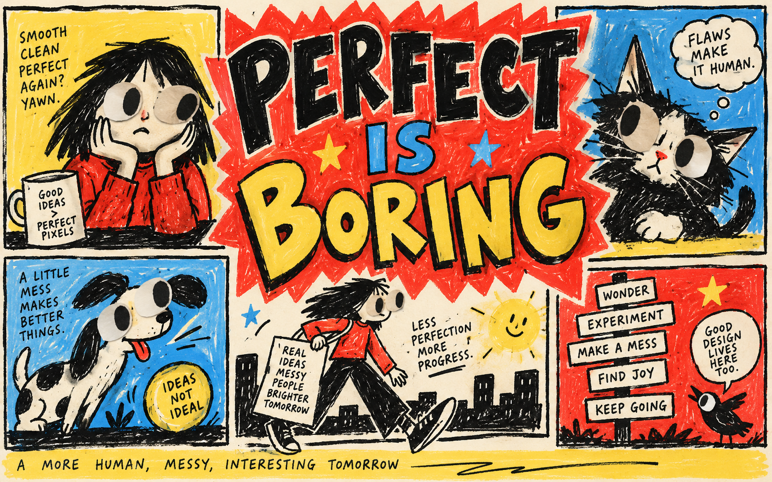
That tension is showing up everywhere in illustration. Hand-drawn lines, awkward little characters, rough textures and slightly messy compositions are being used as a way to escape the polished sameness that has taken over so much visual work. Creative Bloq's 2026 illustration coverage calls the shift messy, meaningful and human.
The mistake is thinking messy means careless
Good roughness still has a point. The wobble might make a character feel friendly. The uneven colour might make a printed piece feel physical. A hand-drawn mark can tell the reader that this is not another anonymous template.
The hard part is choosing which imperfections to keep. If every edge is random, the work just looks unfinished.
Make the imperfection repeatable
Scan one real pencil mark and use it consistently. Keep the same three colours. Give every character the same odd little eye. Let one corner be slightly off in every frame.
That is how “human” becomes a visual system instead of a filter slapped on at the end.
Try this: draw one shape ten times, choose the best three, and build a small pattern from the differences.
Useful resource
Open the source: Creative Bloq ↗
Start with the primary source, then follow the practical takeaway in this story.
Open resource