
Product Design
Someone Twisted Two Lexus Cars Into Giant Sculptures
These are not concept cars waiting for a brave customer. They are real Lexus vehicles turned into sculptures that look like somebody grabbed the whole car...
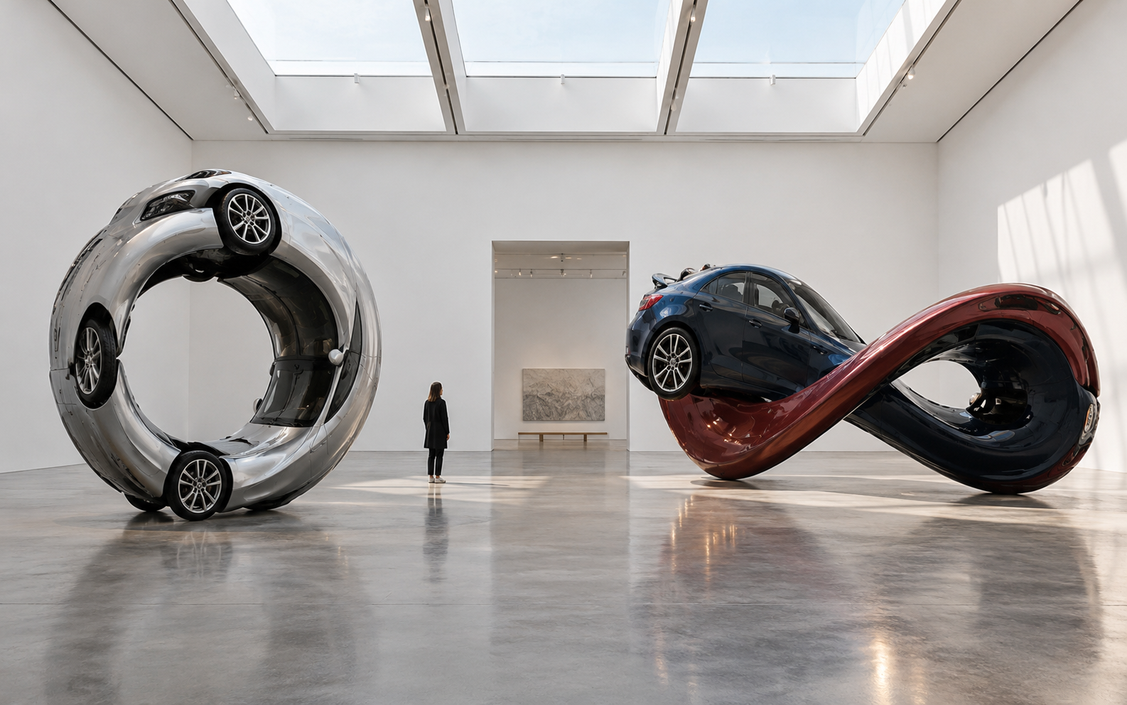
These are not concept cars waiting for a brave customer. They are real Lexus vehicles turned into sculptures that look like somebody grabbed the whole car and wrung it out.
The project, called MOTOMORPHOSIS, came from MSCHF in collaboration with Lexus. The two vehicles were reimagined as a Circle Car and a Twisted Car for an art-show installation in New York. Designboom's photographs show the clever part: enough of the original car remains for your brain to recognise it, but the proportions are completely wrong.
Why the wrongness works
If you remove every familiar clue, the sculpture becomes abstract. If you leave the car completely normal, it becomes advertising.
The sweet spot is the bit in between. You recognise the wheels, windows and cabin, then your brain gets annoyed because they cannot possibly work together like that.
That is a useful trick for product design, illustration and even SVG work. Start with an object people know, then change one rule so the result is strange without becoming unreadable.
The maker takeaway
You can test this with ordinary objects. Take a chair, a coffee mug or a toolbox and draw three versions: normal, stretched and impossible. Keep two or three recognisable details in each version.
The strongest one is usually not the most complicated. It is the one where someone can identify the original object in half a second, then spend another five seconds wondering what happened to it.
Try this: distort one everyday object while keeping its most recognisable silhouette feature intact.
Useful resource
Open the source: Designboom ↗
Start with the primary source, then follow the practical takeaway in this story.
Open resource