Product Design
The $35 Pen People Are Comparing to Montblanc
There is a very specific kind of product story that makes people angry: a cheap object that looks suspiciously good.
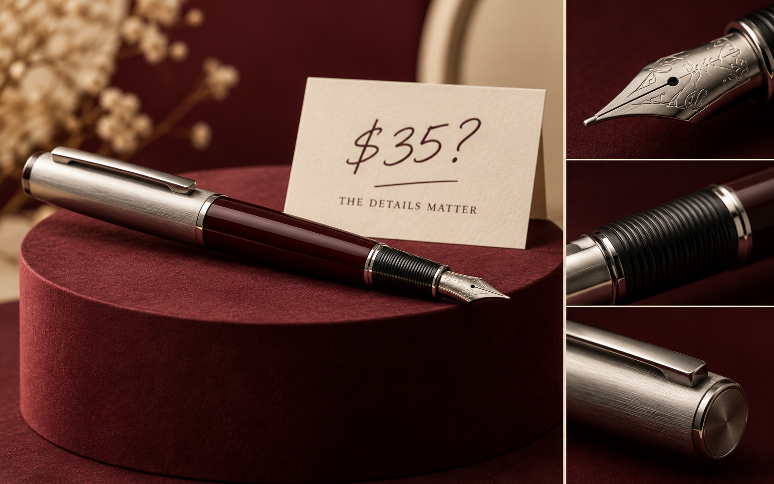
There is a very specific kind of product story that makes people angry: a cheap object that looks suspiciously good.
The comparison is not really about whether one pen is “better” than another. It is about which details make something feel expensive: weight, balance, cap movement, material, packaging, the click, the nib and the first line on paper.
Expensive-looking is a collection of small decisions
Good product design rarely depends on one magical feature. It is the quiet pile-up of decisions you notice without naming: the edge is not too sharp, the surface does not squeak, the lid lands properly and the thing feels balanced in your hand.
That is useful if you make products yourself. You may not be able to change the entire object, but you can improve the handoff, the packaging, the label, the finish or the first five seconds of use.
Compare the moment, not just the price
Put your own product beside the thing you want customers to compare it with. Take away the logo. Pick it up. Open the package. Look at the back. Which one feels more considered?
The answer will usually be found in one annoying detail you can actually fix.
Try this: film somebody opening your product without explaining anything. Watch where they hesitate.
Useful resource
Open the source: Creative Bloq 2026 news archive ↗
Start with the primary source, then follow the practical takeaway in this story.
Open resource